A decade later: Was the London 2012 logo really that bad?
Are logos completely subjective? Or can you apply objectivity to them? How would this work with the London 2012 logo? Was it really as bad as we remember? And who the heck are Wenlock and Mandeville?
Riots in the streets! Explosions! A brick tossed into a washing machine!

All the bad things.
Well, mostly just a bit of moaning, but the point is that people hated the London 2012 Olympics logo.
This guy.
A bizarre combination of Lisa Simpson doing a naughty thing, Nazis, seizures, and racism surrounded the logo when it was launched in 2007.
Yikes.
Wolff Olins were apparently paid £400,000 (about $480,000) for the project, which caused people to lose their damn minds. But was it really that bad? A decade has passed, and we’ve all had time to take a deep breath and cool off.
In this piece, we’ll get into the weeds and analyse the London 2012 logo. We’ll open up old wounds and poke around. It will be emotional, and we’ll all feel some feelings. But most importantly, we’re going to gain closure. Shhh. It’s going to be okay.
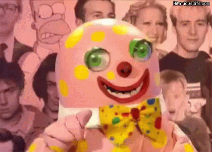
Look, even Wenlock and Mandeville are here to soothe you. Remember these guys?
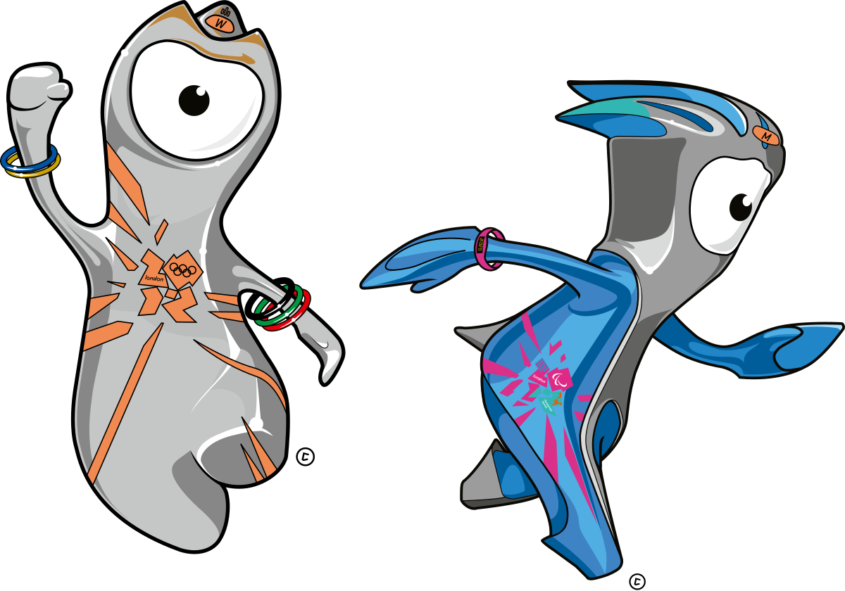
They’ve wobbled over with their bulbous heads and streamlined shafts. They won’t leave until you tell them that you feel better. Or you kill one of them.
The choice is yours.
How can you assign a score to a logo?
What makes a logo great? Or awful?
It’s easy to spot the shockers, but what about the perfectly average ones? How can we rate those?
Personal preference and subjectivity can play a part, but surely we can boil it down and apply some science, right?
Visual identity theory can be a black hole of opinions disguised as fact. This blog included. I’m not an expert; nobody is. I’ve simply been doing this professionally for many years, so I’m slightly more informed than someone who hasn’t.
But let’s take the common themes people use when analysing how ‘good’ a logo is. The following questions are generally asked:
- How simple is it?
- Is it memorable?
- Will it age well?
- Can we use it in all the necessary places?
- How appropriate or relevant is it?
- What is unique about it?
- Can we scale it well?
- Does it have a purpose?
- Is it fit for that purpose?
- How distinctive is it in its field?
- How suitable is the typography?
- How well has the design been technically executed?
Linus Boman uses a scoring system in this video that formed the starting point to my concept, so be sure to give that a watch afterwards.
Introducing the ultraviolet spam test
I've created a system called the UV SPAM TEST to shoehorn objectivity into an arena where much boils down to personal preference.
It condenses the questions listed above and is lazily named after the first letter of each section:
Unique
Versatile
Simple
Purposeful
Appropriate
Memorable
Timeless
Execution
Scalable
Typography
The way it works is simple. Each of the 10 sections has a maximum score of 10 points. 0 is extremely bad. 10 is extremely good.

Once the ultraviolet spam test has been administered to a logo, we conveniently get a score out of 100.
I don't math too good, so this means working out the percentage is easy peasy.
And there we have it, an off-the-shelf way to rank, rate and compare logos. Let's all pull our test tubes out, wave them around and begin.
Unique - 10/10
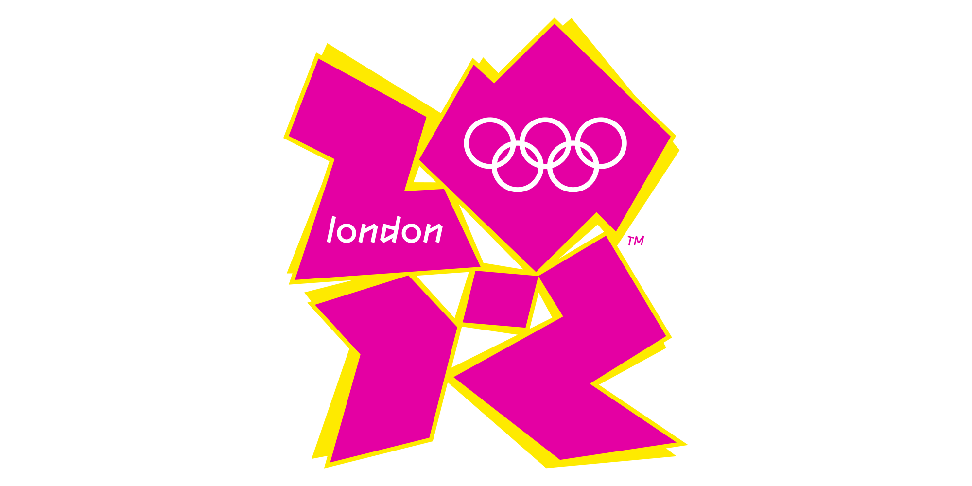
Let me show, rather than tell you, why the London 2012 logo is unique.
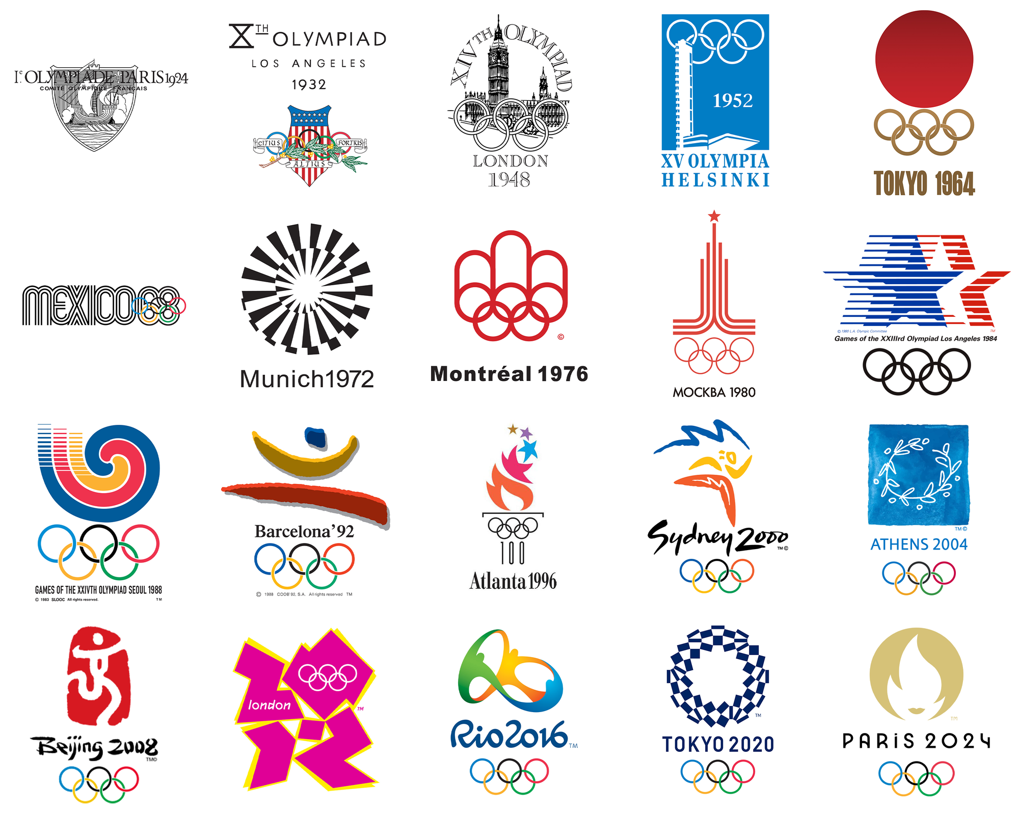
Most other Olympic logos are formulaic. View them in order, and they are delightfully predictable.
In layout, style and colour palette, 2012 gives you an Oscars-worthy slap.
Everything is different, and it breaks 116 years of rules.
Versatile - 6/10
I often tell clients when presenting branding concepts; your logo will rarely appear in complete isolation on a white background.
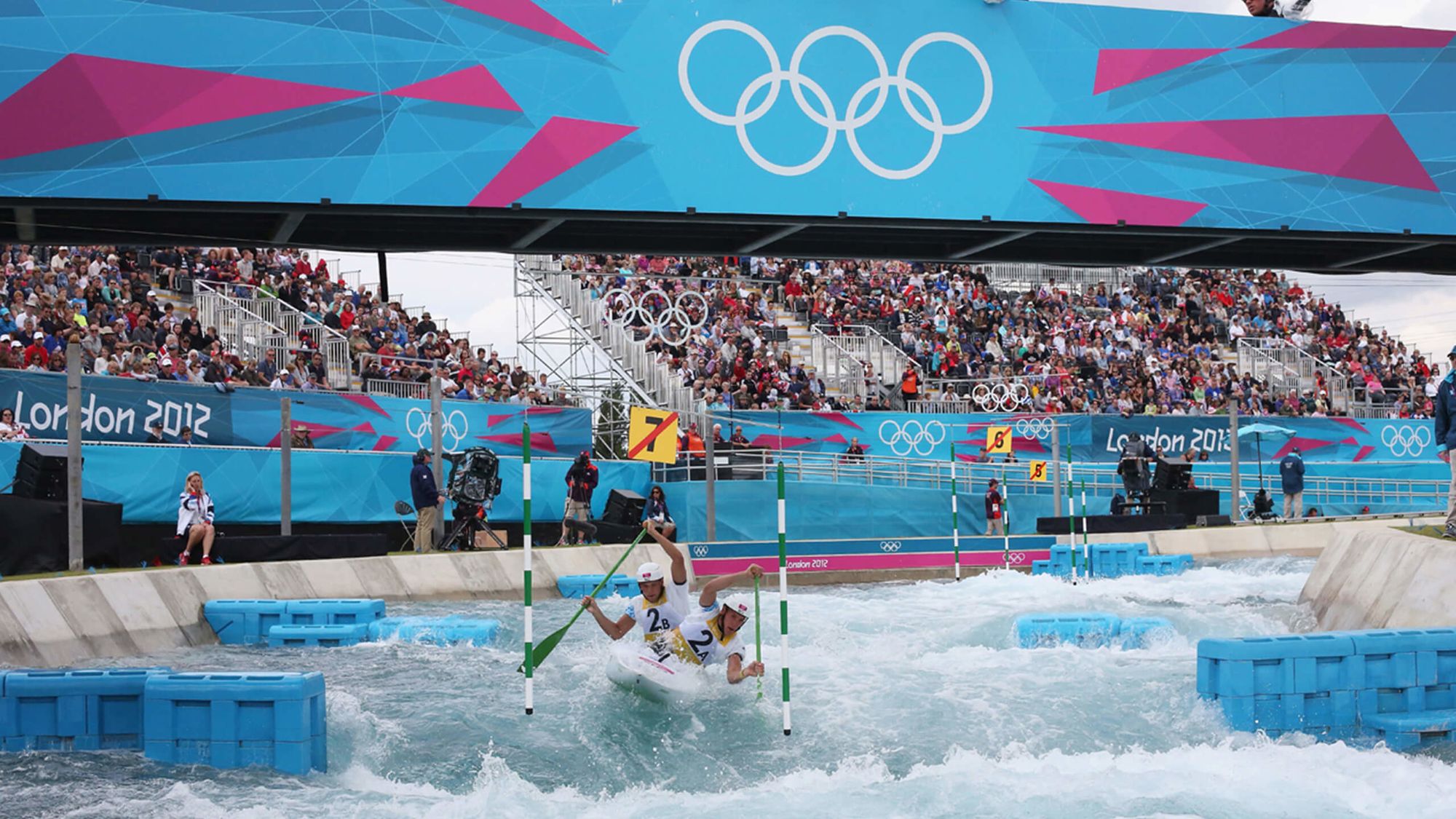
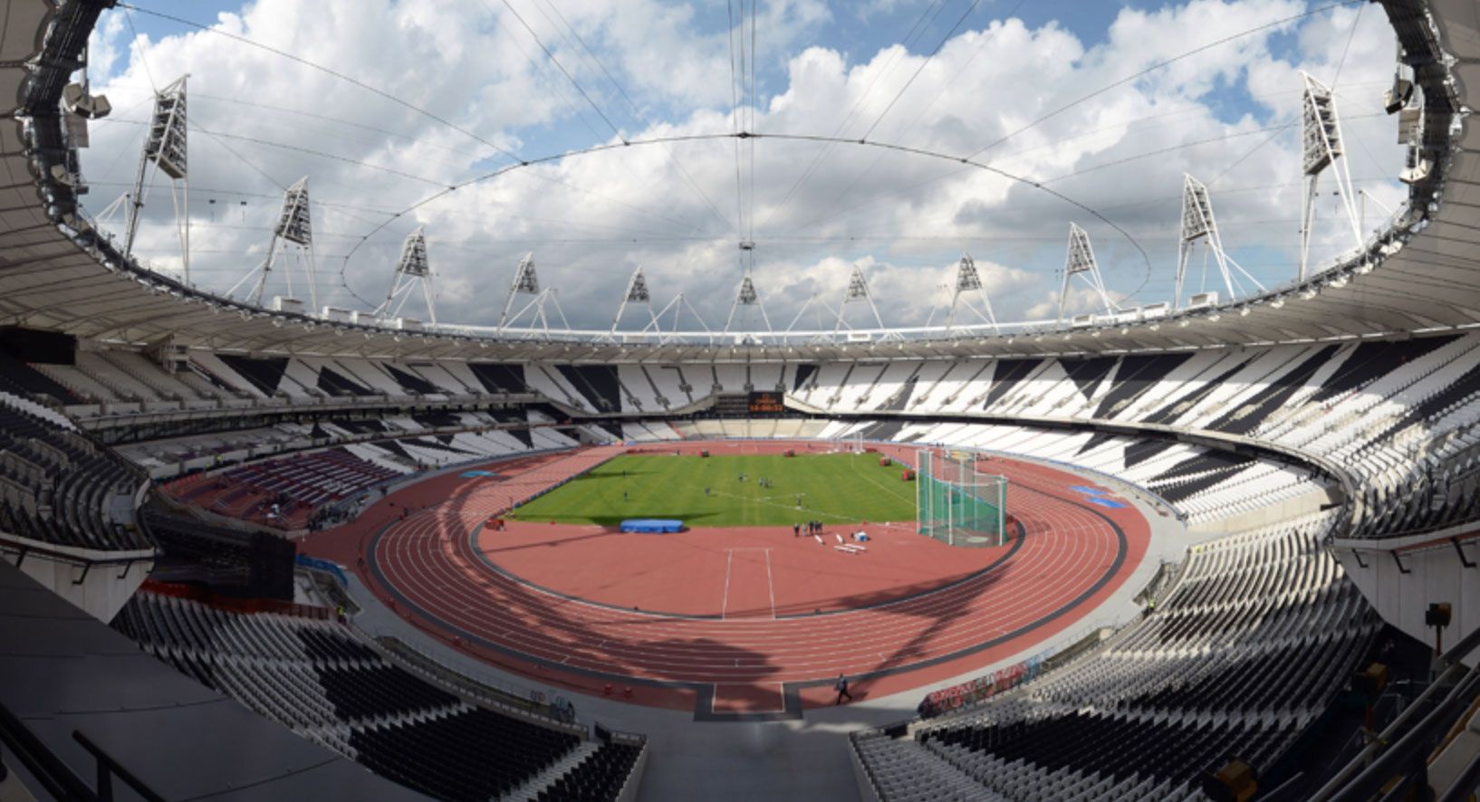
The environment will influence its effectiveness and will be the actual test of a ‘good’ logo. So how does London 2012 perform? While it got torn to shreds at the grand reveal, during the games, it actually worked quite well.
The loud colour palette sat nicely in the various arenas, the pictogram system made sense, and the grid that runs through the logo worked as a system to decorate signage, stadiums and motion graphics.
Simple - 3/10
The simplicity of the concept gains 3 points, but the execution is very much complicated.
Other Olympics logos tend to take an aspect of the host nation and focus on that. We have the stars from the U.S flag for Los Angeles 1984. Athens 2004 sees a traditional wreath, linking the prize given at the ancient games. Sydney 2000 shows a little boomerang man with the peaks of the Sydney Opera House above him. It’s all very formulaic. London 2012 veers sharply away from this by simply showing the numbers 2012, the Olympic rings and the word ‘London’.
The simplicity stops there. The jagged geometric nature sees 33 edges, an off-centre shadow and an awkward square composition that requires an element of deciphering what is actually being said.
Purposeful - 5/10
Let’s break down what the point of an Olympics logo is:
- To create a coherent brand around a specific games
- To differentiate the games from other years
- To provide a visual identity to stadiums, advertising, media etc.
- To represent the host city and its time in history
- Build excitement for the Olympic spirit
Was 2012 successful in doing this? I’d put the result bang in the middle of the scale, with a solid 5/10. In my opinion, it doesn’t represent London or the UK in a significant way.
The primary concept that Wolff Olins clung to was ‘an Olympics like never before'. While the logo did this, I feel it missed the spirit of what the point was.
The secondary concept for the logo was ‘Everyone’s Olympics’, which is quite ironic as ‘everyone' hated it.
The 5 points I’ve awarded are for the fact that the extended branding sits together quite well and how it got people talking about the games.
Appropriate - 2/10
Bringing people together and fostering world peace are two huge values of the Olympic games. The logo needs to help cultivate these feelings, so you can probably see where I’m going with this.
The fact that people were so mad about this branding exercise stamps out any feelings of peace. Although, I guess it could be argued that they did band together, just unfortunately in the same way that football hooligans do.
In many branding projects, clients will say: “I want something different”, and while this absolutely can be a good idea, being different for the sake of it can backfire. There is a certain expectation for logos, and you need to know the rules before you break them. Otherwise, you can alienate your audience.
I believe the London 2012 logo was an attempt to be too clever, resulting in it being too different.
Memorable - 10/10
This is a reasonably easy score to award, as people are still angry about this today.
Being memorable for the wrong reasons isn’t really where you want to be with your brand. I guess you can wait for Stockholm Syndrome to kick in, but it shouldn't be your primary strategy.
The strong initial reaction that people felt was negative, with the BBC reporting that 80% of people polled either ‘disliked’ or ‘hated’ the logo.
The fact that 10.99 million tickets to events were sold from an available 11.3 million shows that there were no hard feelings. People might have hated the logo, but they still turned up to games, bought merchandise and contributed to an estimated £10 billion boost to the UK economy.
And the fact that I’m sitting here writing this is a case in point, I suppose.
Timeless - 2/10
DIY-type systems were very much a trend of the late 00s, and the logo as a whole feels very much of that era.
Take Munich 1972, for example. It hasn’t aged a day. Comparing it side by side with the Tokyo 2020/21 games, they share many similarities.
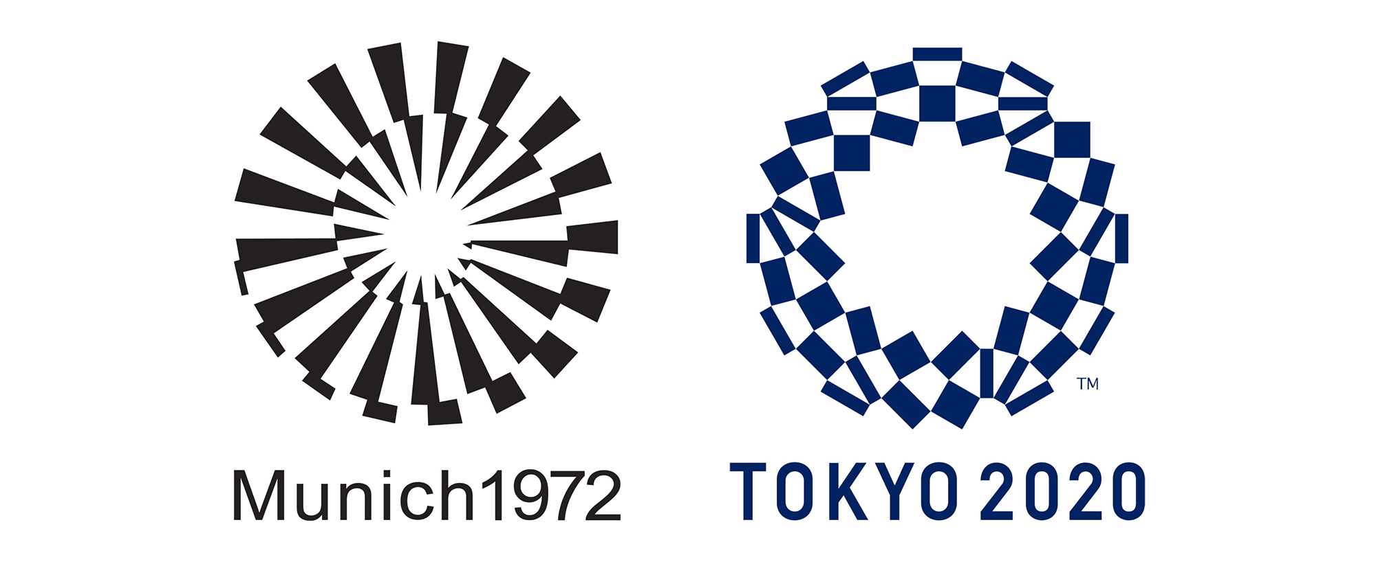
The same is true for Moscow 1980. Elegant and subtle geometric design gives it a timeless feeling, whereas London 2012 lacks this. It is loud, shouty, and feels dated.

Execution - 4/10
While it makes for a bit of fun, the dodgy Lisa Simpson references and the links with the SS should have been swept up and dealt with before the logo was released into the wild.
We’ve all been there as a designer. You are too close to a project, and some wise person skips past your desk and says, “ah that looks like X, Y or Z”.
Phil Bray, Founder of The Yardstick Agency, once pointed out that something we’d created bore a resemblance to the tortured signature of Guy Fawks. A niche and slightly worrying reference, but one not to ignore.
The 4 points I’ll give it come from how the grid that runs through the logo is used for extended applications.

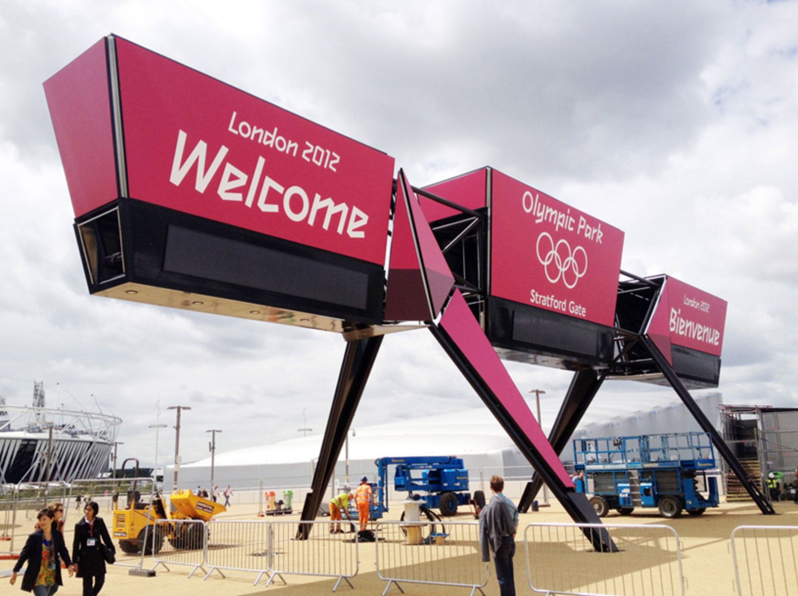
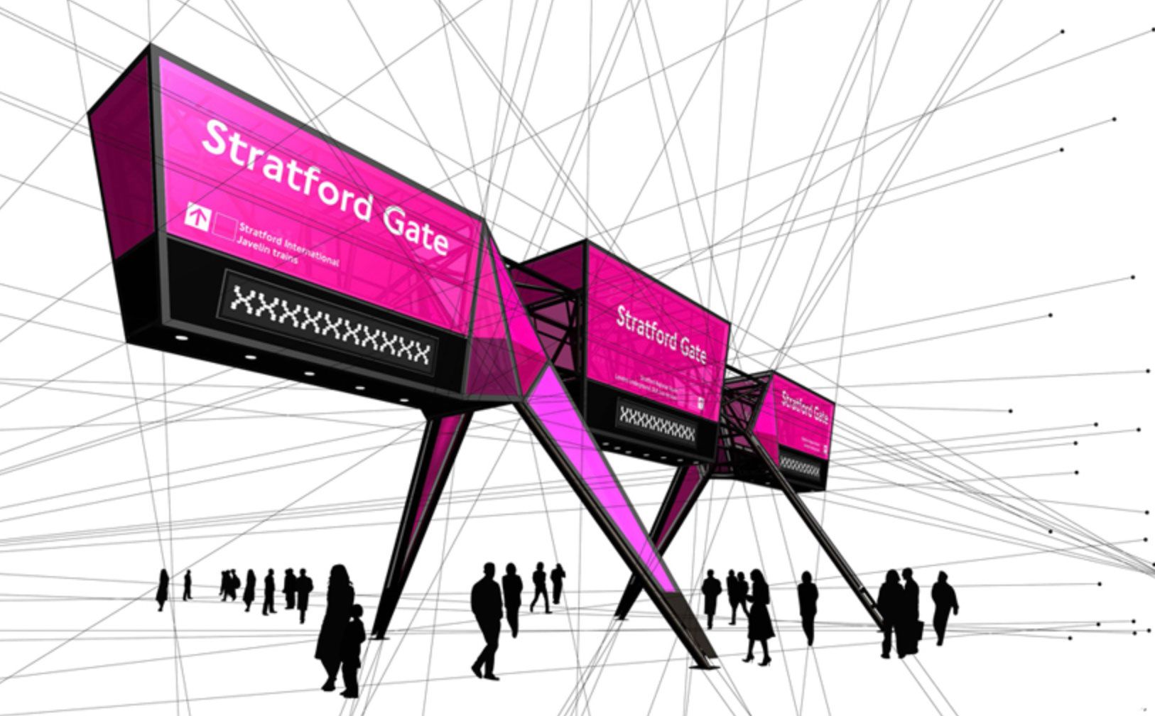
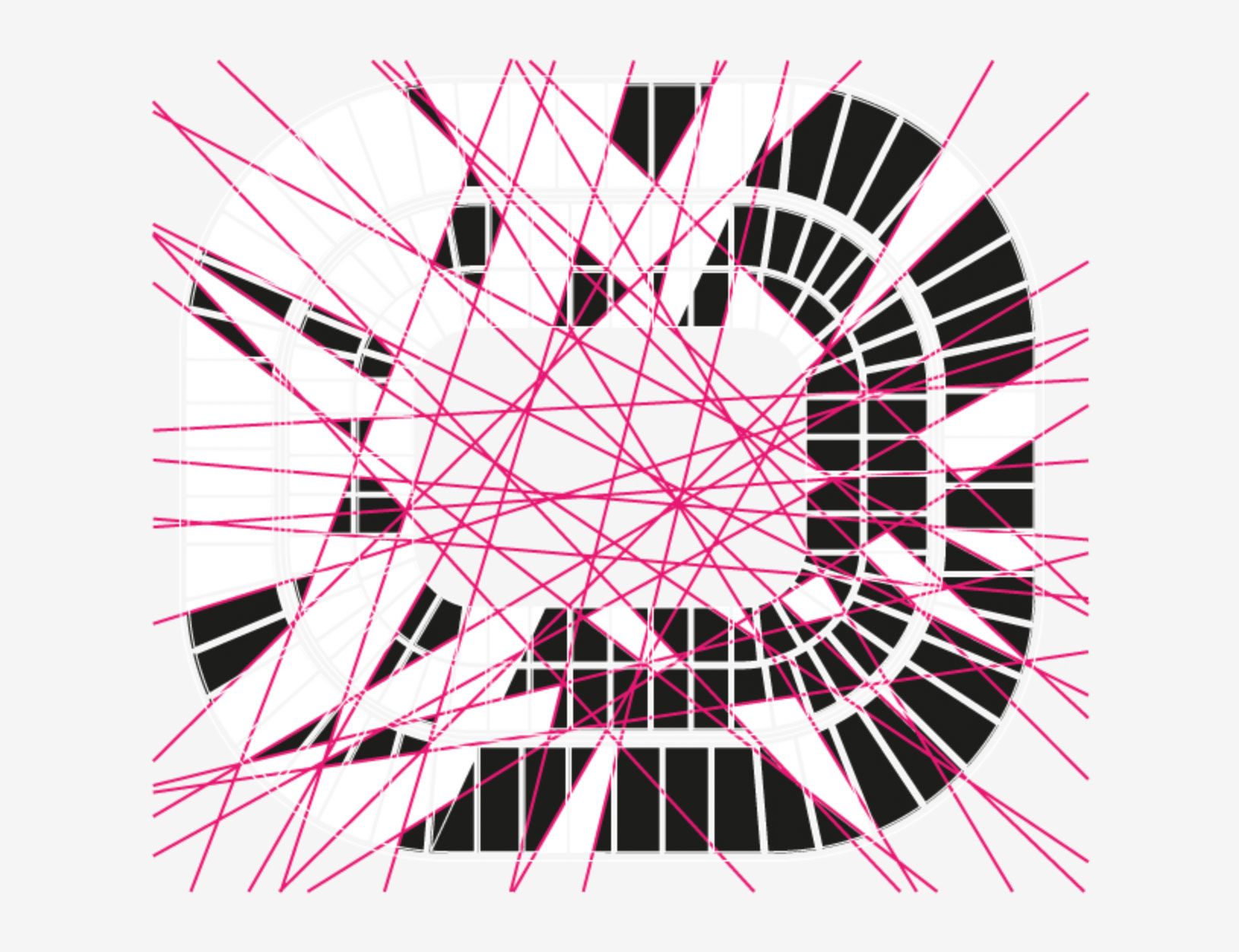
As you can see here, the grid on which the logo is sat runs through everything, from the shape of structures in the arena to the arenas themselves.

Scalable - 4/10
This category sees us analysing how a logo can be used at both small and large scales.
I’ll award 4 points here, as some of the smaller reproductions of the logo get lost in the branding.
For example, the ticket designs do a great job of showcasing the event in question, but the logo is so small you can't read the word 'London'.
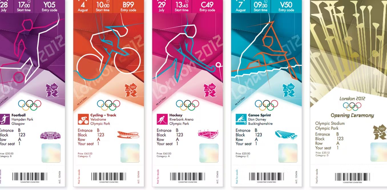
Perhaps not a huge deal for this scenario as the Olympic rings make the context obvious. But taking the concept of scalability in isolation, we can't give it any more than a 4.
Being scalable links with simplicity, the metric at the very start of this list. Generally speaking, the simpler you can get, the easier you’ll find it to scale things down to those odd situations where things need to go teeny tiny.
Typography - 3/10
How effective is the use of typography?
If the logo twisted people’s turnips, the typeface drove round your Nan’s house and hammered frozen sausages into the old dear’s lawn.
I’m talking about the part of the logo that says ‘London’.
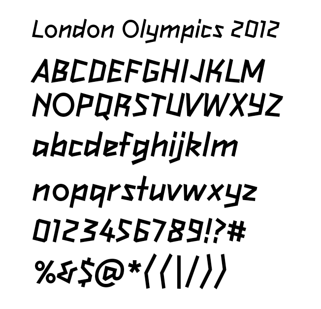
‘2012Headline’, broadly based on a geometric face called ‘Klute’, was designed by Gareth Hague.
It’s probably unfair to join in with the theatrical critique for the type, as I believe it was a hostage of the concept. It’s not great, but it was added once the overall logo had been signed off.
I’m usually a fan of odd typefaces, such as Keedy Sans, but I can only give it three of those delicious points in this context.
Have we passed the UV Spam Test?
After much squinting, stroking my chin and saying, “hmmm”, I count 49 points.
A 49% rating is interesting because the main bulk of that was the shock value aspects. Full points for being memorable and unique don’t mean it’s a good logo, especially when it led to people having seizures. Mr Blobby is memorable and unique, but keep that guy the hell away from me.
You can no doubt already tell, but I’m fascinated by the story of the London 2012 logo. They had so many opportunities to play it safe, pocket the £400k, and just stick a Union Flag on there. A few people would have said: “It’s a bit kitsch”, but your Dad’s mate at the pub would have a tear in their eye and say: “It’s bloody great, makes you proud, doesn’t it?”.
Instead, they threw a house brick through a window, and it all kicked off. Good design often requires confidence and pure belief that the vision will work. Wolff Olins were perhaps a tad too confident, but they stayed on course, and nothing got diluted. You have to respect that.
So was it really that bad? I’m not sure. Bad is probably the wrong word. Misguided, and unapologetic? Absolutely. Aggressive and trying slightly too hard to be edgy? Yeah, I think so.
If you've found this post educational, let me know in the comments below. What are your thoughts? Do you agree? Or do you disagree so Olympically that you want to poke me in the ribs with one of those long pole vaulting sticks? Please don't do that.
When I was editing this, I realised they're simply called 'poles'. Still, don't poke me please.

For more design basics stuff, click here, and for productivity stuff, click here. If you liked this piece you'd probably be interested in this one about design fundamentals, and how they are used in podcast covers, so go there next.
Remember to keep clear of Wenlock and Mandeville, I'll catch up with you in the next one.
Want new articles instantly?
Join the newsletter list to read pieces the moment they're published.
Subscribe