Judging a podcast by its cover - the 10 design fundamentals
What are the 10 fundamentals of graphic design? How can we utilise them to make content more engaging and appealing? Why do we judge a book by its cover? Does the same logic apply to podcasts?

I'm a shallow scumbag.
There. I said it. And I’m not sure if I'm sorry.
I buy wine if it has a pretty label and decide what to watch purely from the Netflix thumbnail.
In the grand scheme, I've missed out on all kinds of good stuff. But it also highlights the importance of design. I'm not alone, and you're likely a shallow scumbag too.
So let's dig a little deeper. Why are we drawn to certain things and not others? What are the factors that convert a mindless scroll to a stream, download or purchase? Design fundamentals play a large part, and today we're going to highlight 10 of them, and use podcast covers to demonstrate how.
I'm a massive fan of the whole 'show, don't tell' shtick, so let's get shtuck in.
What are design fundamentals?
- Hierarchy
- Contrast
- Consistency & repetition
- Balance & proximity
- Simplicity
- Negative space
- Focal point
- Alignment
- Flow & rythm
- Unity
If you disagree, I'm absolutely unwilling to fistfight you in a carpark. Let's calm things down wee man. Leave my hair alone.
Thank you.
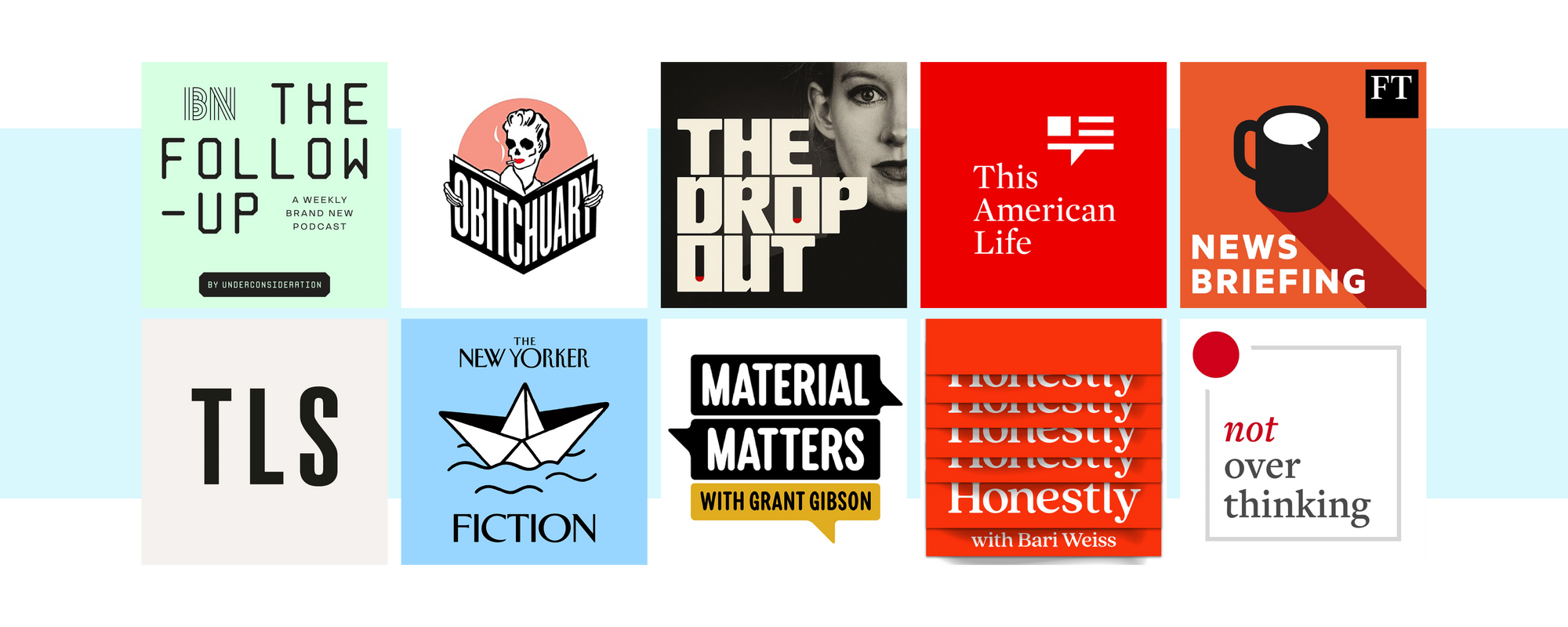
1. Hierarchy - The Follow Up

The order in which you read stuff is important. Especially when there is quite a lot going on. The Follow Up is a splendid podcast, and it's also a top-notch example of hierarchy.
Your eye knows that 'The Follow Up' is the big boy here. Then we've got 'By Under Consideration', AND THEN we know it's a weekly podcast by 'Brand New'. What a time to be alive.
10 words in 3 clusters is quite busy for a podcast cover, but this seems effortless. Note the gentle transitions between typeface and style to really hammer home the gaps between the beginning, middle and end.
Side note: this is a graphic design podcast, so you'd hope that they get it right, but nevertheless it stops you scrolling and makes you click, click, click.
2. Contrast - Obitchuary

I love this cover so much.
Massively subjective view alert, but it's close to perfect. Give me 10 minutes to fix the text (blah, blah, blah) but the soul is definitely there.
Contrast is where opposite elements collide. Dark and light, big and small, sharp and round. You get the idea. It generally applies to:
- Colour
- Shape
- Typography
- Size
But it exists wherever one thing is different from another.
In this example, we get that contrast in an extra dimension, where the 1950s woman becomes a skeleton. This, combined with the condensed black and white text, the subtle splash of colour and the generous white space give it Jon Hamm levels of charm.
3. Consistency & repetition - The Dropout

Tell 'em what you're gonna tell 'em.
Tell 'em.
Tell 'em what you told 'em.
Everybody has taken credit for this quote, from Aristotle to Mr Blobby.
It's true though and works way beyond graphic design. Especially in politics (think the 'Education, education, education' slogan from New Labour in the 90s, or 'crooked Hilary' becoming a whole thing from wee Donny Tromper).
The Dropout is a great example of subtle repetition, with the splash of red inside the counters of the letter 'o'. It ties in well with the subject matter, which is a wild story that centres around a drop of blood.
4. Balance & proximity - This American Life

This one is a bit of an old boy in podcasting terms, and the cover continues in that vein, also being a classic.
Balance and proximity relate to how elements are spaced out, and the distance they are from each other.
You can see here that the stacked text and asymmetrical graphics sit perfectly, giving a fantastic sense of grounding and balance.
Give them a good shake and I promise you they’ll still be standing strong.
Conveniently, this example also shows that things don’t have to be symmetrical to balance. It’s all about trusting your eye and finding the optical centre. I wrote about that very subject in this piece, so head there at some point.
5. Simplicity - FT News Briefing

Sure, there are simpler podcast covers out there, but this isn't a race to the bottom.
Simple is good, basic is bad.
There are five elements here that tell a rich story
- An FT logo so we know the theme is finance
- Coffee mug = morning
- The speech bubble tells us there is a conversation
- A bit of shadow on the mug to make us feel pretty
- Some nice bold sans serif text confirms that it's a news broadcast
Could we strip it back further? Of course. But as with all things design, we need to find that 'Goldilocks' place to pack our paints away. Less is more, and this cover is nicer than it probably needs to be.
6. Negative space - TLS

Even before 2020, I liked socially distancing.
Good design is no different. Give me my space.
We don't all feel comfortable with negative space. There is a strange human urge to fill any gaps, and cram all kinds of weird stuff onto the canvas.
It also extends to conversations, where some people have to fill silence or else they feel all funny.
The key is restraint. And this is an example of just that. TLS is the 'Times Literary Supplement', so we already know we're in the midst of some high brow buddies. But interestingly, we don't go down the usual traditional scholarly vernacular. Oh no. We get three letters of a stocky condensed sans serif and absolutely naff all else. Huzzah, old boy.
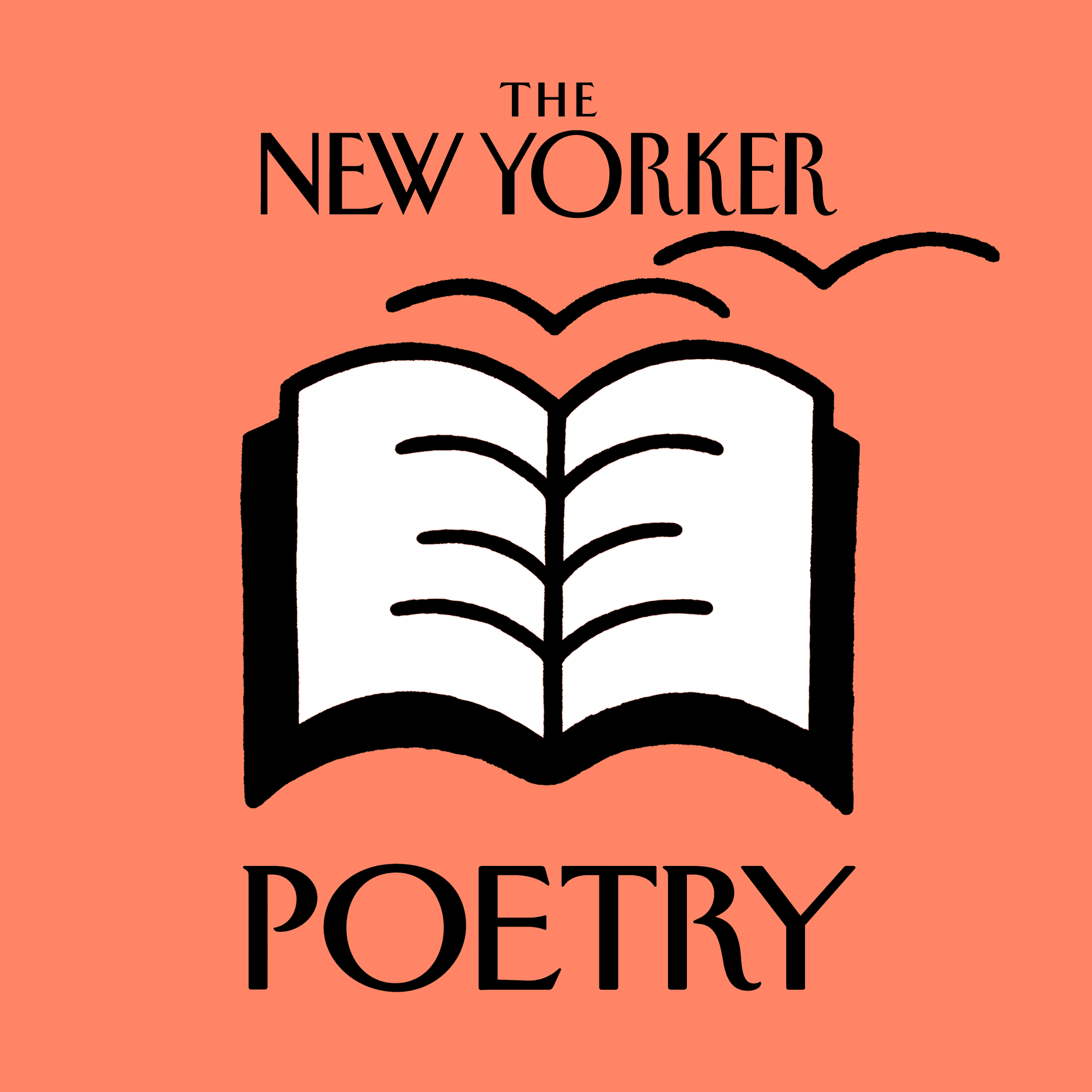
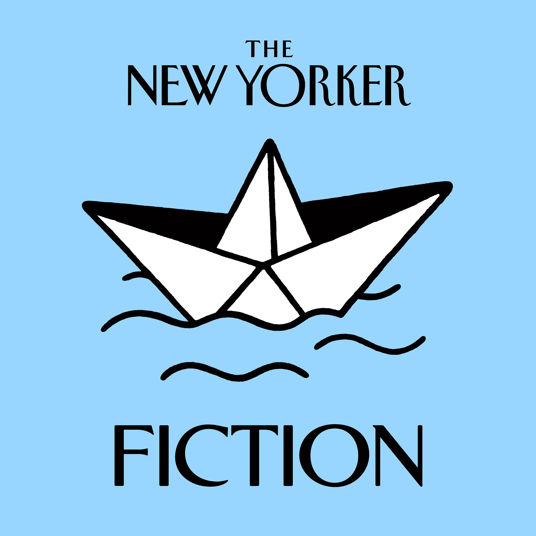
7. Focal point - The New Yorker Fiction

Our eyes benefit from a target. With so much going on in our general field of vision, we're naturally attracted to a strong focal point (I guess because it might be a shark, a rival caveman or more frighteningly, a caveshark).
Take this gorgeous cover from The New Yorker Fiction podcast. We have a playful illustration of a paper boat that jumps off the page and makes you want to rub your eyeballs over it. If you look closely, you'll notice that the focal point isn't in the dead centre of the layout, but slightly above. This position is called the optical centre, and is where our eyes want to rest on a page, making it a natural choice for such a large focal point.
The other covers from The New Yorker follow this pattern, resulting in a beautiful set.
Just for a giggle let’s lay them out and all go “oooooooh”.
8. Alignment - Material Matters

Unless there is an intention behind it, we like things to be lined up. It makes us slightly less afraid of the world, and for a second we forget that the sun is one day going to run out of hydrogen and swallow us all up.
Sorry.
If it helps, it’s a few years away yet.

And besides. You should probably be more terrified by the multiple cases of people inhaling seeds and growing fir trees in their lungs.
But as with the other principles we've looked at so far, bending those rules can be useful too. For example, with the Material Matters cover, we have three speech bubbles lined up well to form a solid and stable base for the text. But the words are centred, rather than being lined up by width.
This ensures that other factors wind their necks in, namely:
- Balance
- Hierarchy
- Focal point
Design fundamentals can only work if everybody is pulling their weight, and neglecting just one can compromise a layout.
9. Flow & Rythm - Honestly

Good design can dictate how your eyes move across a page. Hierarchy, contrast and balance will play a part, but there are plenty of ways you can give your piece energy and movement.
With this example, repetition is used as a graphic device to bring us waaay down to the bottom, where we read the full title and subtitle in quick succession.
This pacing is difficult to master but will elevate any design that gets it right.
10. Unity - Not Overthinking

While it's no 'Wannabe', those Spicy Girls were speaking hard truths with '2 become 1'.
How well your moving parts work as one coherent layout can make or break a design. Unity is what you get when you've applied a bunch of the other principles.
I've selected Not Overthinking as a great example of this because it shows confidence and is well executed. It's also a top-notch podcast that I would heartily recommend, linking design with psychology and sociology.
Are we still shallow scumbags?
So this is our rogue's gallery. It represents all of the design fundamentals and explains why you're just as much of a shallow scumbag as I am.
Bear this in mind when you create and consume. Graphic design doesn't just look good by magic.
Speaking of which, do we have time for a special mention? Of course we do, I own the damn place!
I've recently been listening to the Magic Wand podcast, and it has a gorgeous cover. The vibe is very much 'sit down and chat with a designer', and the thumbnail distils that creative energy perfectly.

Let me know what you think. Are there podcast thumbnails that demonstrate any principles better? Send them over, let's have a look and we’ll all try to become slightly deeper individuals.
If you've found this post educational, let me know in the comments below. What are your thoughts? Do you agree? Or do you disagree so scarily that you want to spice up somebody’s life? Please don't do that.
For more Design Basics stuff, click here, and for Productivity stuff click here. If you liked this piece you'd probably be interested in this one about learning to trust your design eye, so go there next.
Remember to keep the sun topped up with hydrogen, I'll catch up with you in the next one.
Want new articles instantly?
Join the newsletter list to read pieces the moment they're published.
Subscribe