The best colour palette tool for designers: A Coolors love story
What is the best colour palette tool to use in 2022? Is the best one worth shelling out some hard-earned pennies for? How did I accidentally convince my Mother-in-law I was colour blind?

There’s a common saying that if something is free, you’re the product.
This is quite sad because I’m an awful product.
I complain a lot, I’m not a very safe driver, and I have a habit of making things up. Like the time I accidentally convinced my Mother-in-law I was colour blind.

It happened so gradually, and I thought she knew I was winding her up. Understandably, she thinks I’m far less impressive now that the magic colour blind designer is no more.
After she discovered the truth, I wondered how I would have survived in my job if I had been genuinely colour blind. The answer is a colour palette tool called Coolors, and this is where we come full circle about a free service making you the product.
See, on January 17th 2022, Coolors unveiled their new revenue structure, which saw the introduction of a paid-for premium level. Before that, it had always been entirely free and supported by adverts. The vocal minority of people were upset because previously free features were now hidden behind a paywall.
We're back with some important updates ☀️ pic.twitter.com/hrWuo4ELn3
— Fabrizio Bianchi (@_fbrz) January 17, 2022
It’s a fascinating move and one that I ultimately support.
This piece will serve three purposes:
So gather your cones and rods, and let's wade into the argument.
What is Coolors?
Designers tend to build colour palettes for projects in the following ways:
- By eye (you despicable, talented animals)
- Juggling physical colour swatches
- Using digital generators
- Begging, borrowing or stealing from other projects
It wasn't unusual to have Pantone books surrounding me a decade ago, but I combine digital tools and my beady little eyes nowadays.
Enter Coolors, the endless colour generator that spits out values based on the following rules:
- Random: Uses a combination of different colour harmonies
- Monochromatic: Uses shades, tints and tones of the source colour
- Analogous: Hues sat next to each other on the colour wheel
- Triadic: Hues spaced evenly around the colour wheel
- Tetradic: Two complementary pairs
- Complementary: Hues sat opposite each other on the colour wheel
- Split complementary: Hues adjacent to a primary value's complement
- Square: Four hues spaced evenly around the colour wheel
This makes Coolors great for forming a starting point when you're struggling and building multiple tones around specific colours.
It's handy in front of clients, as it shows them lots of colours at once that are likely to work as a set. It can quickly rule out avenues when they aren't sure or will 'know when they see it'.
How much does it cost?
There are five different versions of Coolors spread across various platforms:
I bought an Adobe plugin for £2.50 / $3.49 in 2021, but this has since been discontinued.
Let's focus on the full browser version first, as the other platforms are basically 'light' versions of this.
The free account allows you to:
- Browse 10,000 premade colour schemes
- Save up to 10 palettes
- Save one project and one collection
- Allocate five favourite colours
- Extract colours from an image
- Create collages (more on this later)
For most designers, this gives you a decent starting point, but the restriction on saving projects reduces its usefulness in the long term.
A 'Pro' account gives you access to the above, plus it allows you to:
- Browse over 5,000,000 premade colour schemes
- Save unlimited palettes
- Save unlimited projects and collections
- Allocate unlimited favourite colours
- Work with colour libraries
- Export with advanced options (such as including your company logo on PDFs)
- Build a 'Pro' profile page (I set up an example here)
- Access a palettes dashboard
Is a 'Pro' account worth it?
I've been using Coolors for free across various accounts since 2015. It has remained, in my opinion, the best colour palette tool available.
I completely get why some people are upset about the change to a paid-for model. If you have many years of palettes saved, you're forced to upgrade to maintain them (or add to them).
In the grand scheme of things, £29 per year is more than worth it for the time it saves me and the features it offers. Coolors was created by the indie developer Fabrizio Bianchi, and I'm happy to support the project financially.
Since changing to a paid-for model, new gadgets such as an SVG recolouring tool have been released, so it's exciting to see what this recent influx of revenue will mean for Coolors.
What are your thoughts? Do you feel upset about the ad-supported free model? Is the price fair for what you get in return? I'm keen to see your comments at the end of this piece.
How can it help your workflow?
When working with colour, your workflow boils down to two things:
Input
This is the creation phase. It's when we're pulling inspiration from various places and bringing them together. Coolors allows us to manually enter colour values or upload images to pull information from.
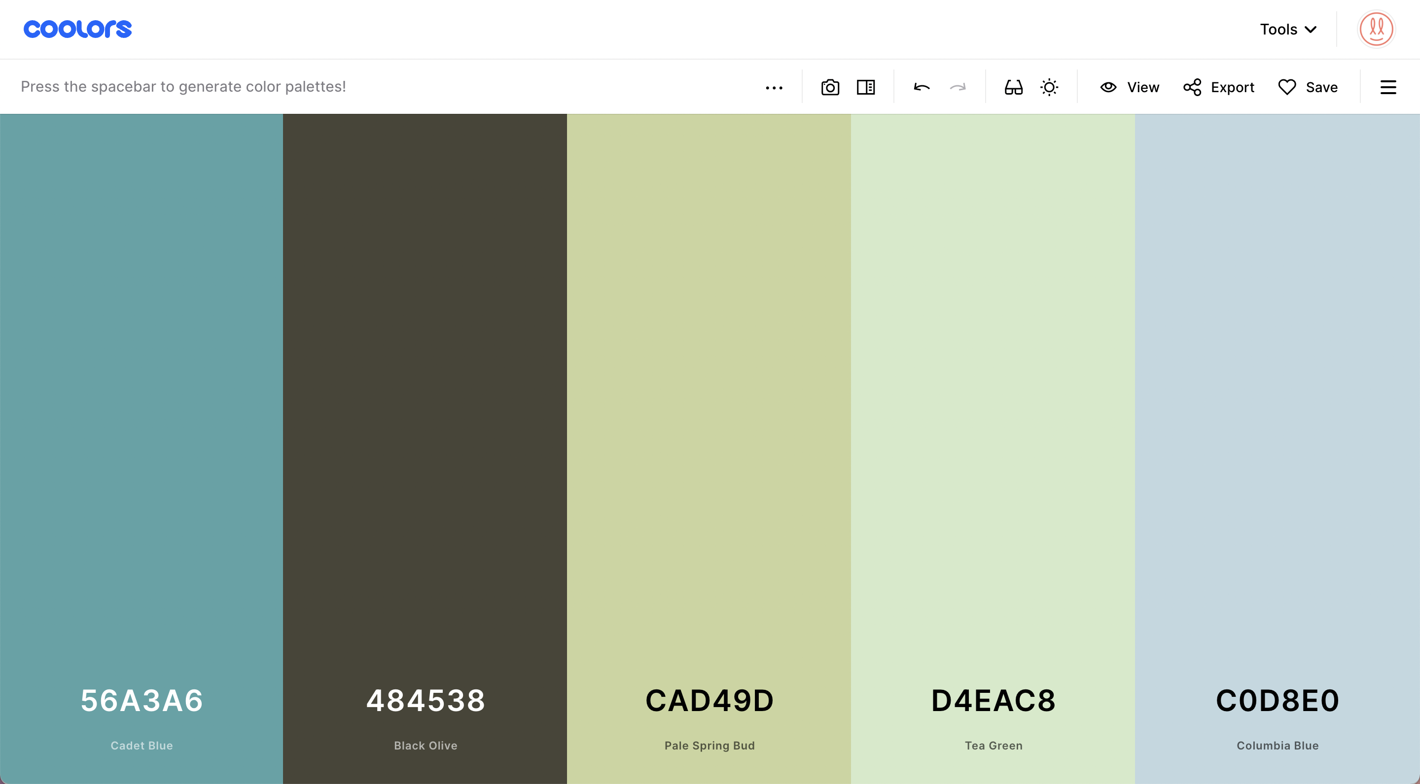
From a practical point of view, the dashboard shows stripes of colour that you can edit and lock. Once colours are locked, anything left unsecured will be switched with a semi-randomised value every time you hit the space bar.
The random nature is tied to those mathematical colour theory algorithms we discussed above.
While you get a different colour each time you hit the space bar, it will be linked to the colours locked down on the board. This makes it exceptionally client-friendly as you can whizz through a pile of ideas in front of them to help develop your conversation.
Output
Once we have the perfect palette in front of us, we need to communicate that to various people and places.
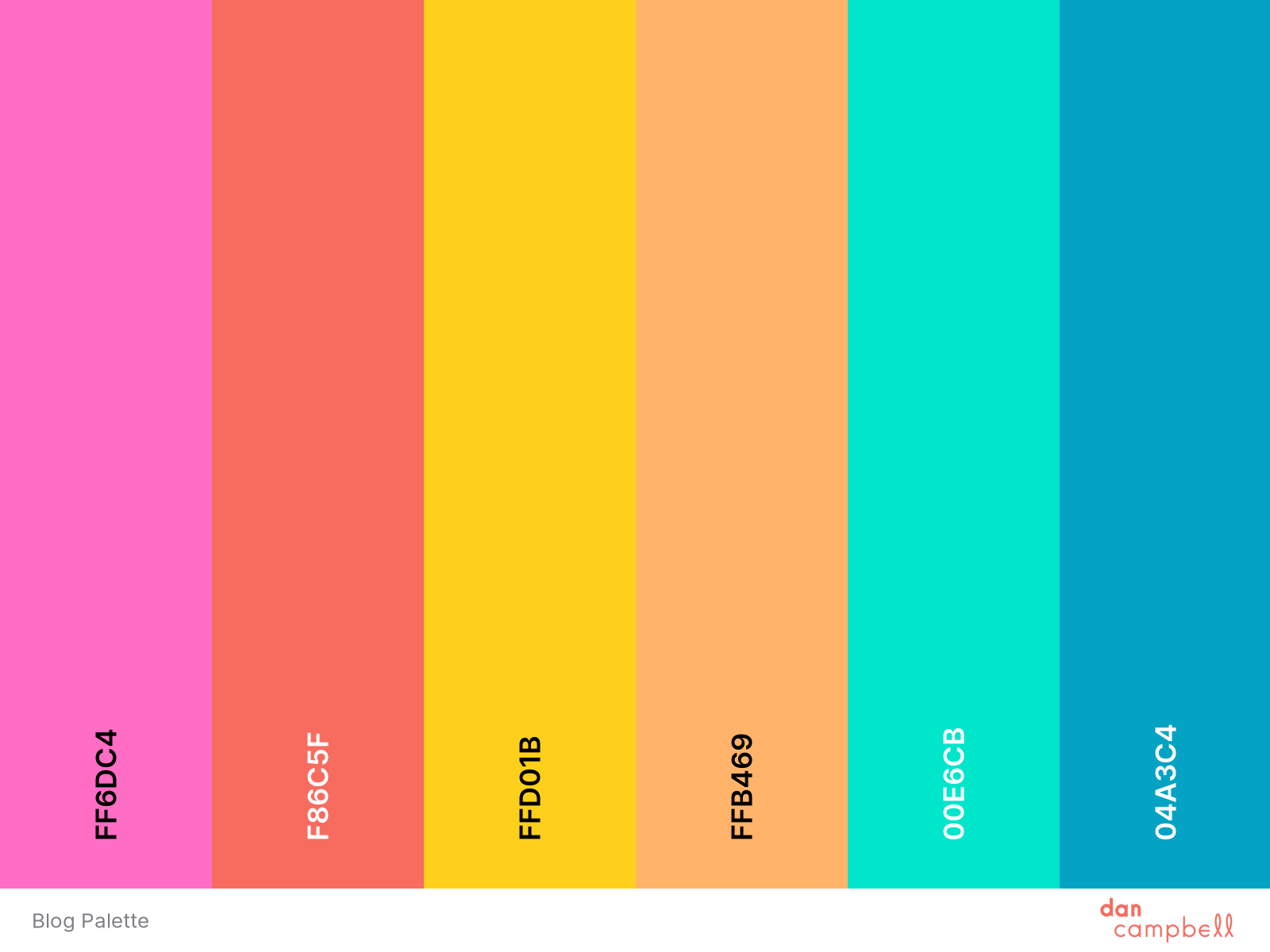
First and foremost, you can export your palette in several formats and with varying levels of detail.
This ranges from a simple 'at a glance' image like this:
To massively in-depth multi-page reference PDFs like this:
This has sheets of shades, tints, accessibility analysis and references for colour systems such as Pantone or RAL. This is handy for presenting to clients, as you can tailor the output to their specific needs (and required level of detail).
Next is how we use the colours in other programs. You can export your palette as an .ase swatch file for Adobe software or .svg for other platforms. Embedded links and CSS data can also be exported instantly. The variety is useful when working with large teams of designers, and the common link to a Coolors account means you can update any changes or client amends quickly enough.
As with many design tools, I feel like I'm only scratching the surface with the potential of Coolors, but so far, I use it quite heavily in my day to day workflow.
Are the apps any good?
A completely free iOS and Android app exists. This slightly condensed version allows you to assemble palettes on the move and save them to your account for further work on your primary workstation.
I initially thought this was a bit of a gimmick, but I was surprised by the amount I use it. It's handy to take a snap of something and quickly adjust the values while fresh in your mind. Not essential by any stretch, but they earn their place in the 'nice to have' category.
What Accessibility tools does it have?
Around 300 million people in the world have some type of colour vision deficiency. I work with plenty of clients who are colour blind, which makes it especially important to prepare for how the audience might view specific palettes.
Coolors allows you to build a palette, then compare how it will be viewed by people who have:
- Protanopia
- Deuteranopia
- Tritanopia
- Achromatopsia
- Protanomaly
- Deuteranomaly
- Tritanomaly
- Achromatomaly
This can help you tweak a palette so that certain accompanying tones don't get lost and increase accessibility among your audience.
Built-in luminance maps can also give you an idea of the contrast your palette has as a whole. Again, this is an often forgotten aspect that gives your design a fighting chance among people with differing levels of vision.
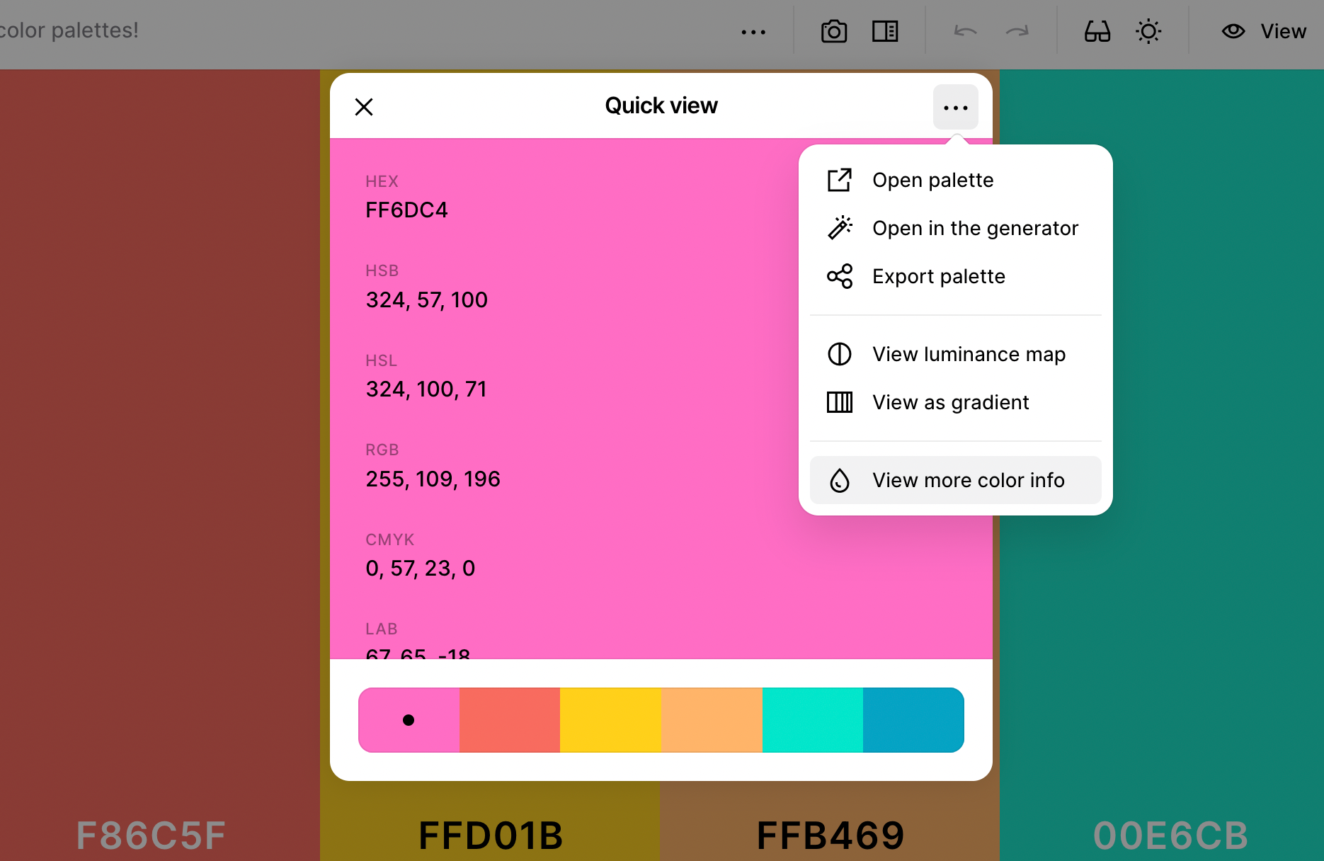
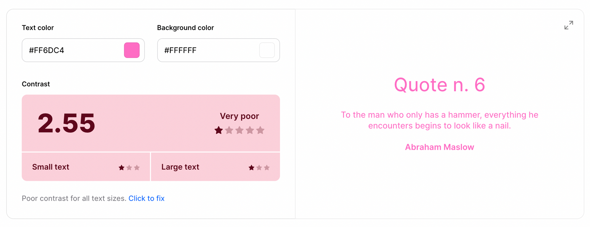
Finally, the other big accessibility tool is the contrast checker. If you isolate a colour and click 'view more colour info', it opens up an in-depth analysis of that particular value. Among this information is a contrast scoring system that shows you how well text works with the colour and how legible it might be.
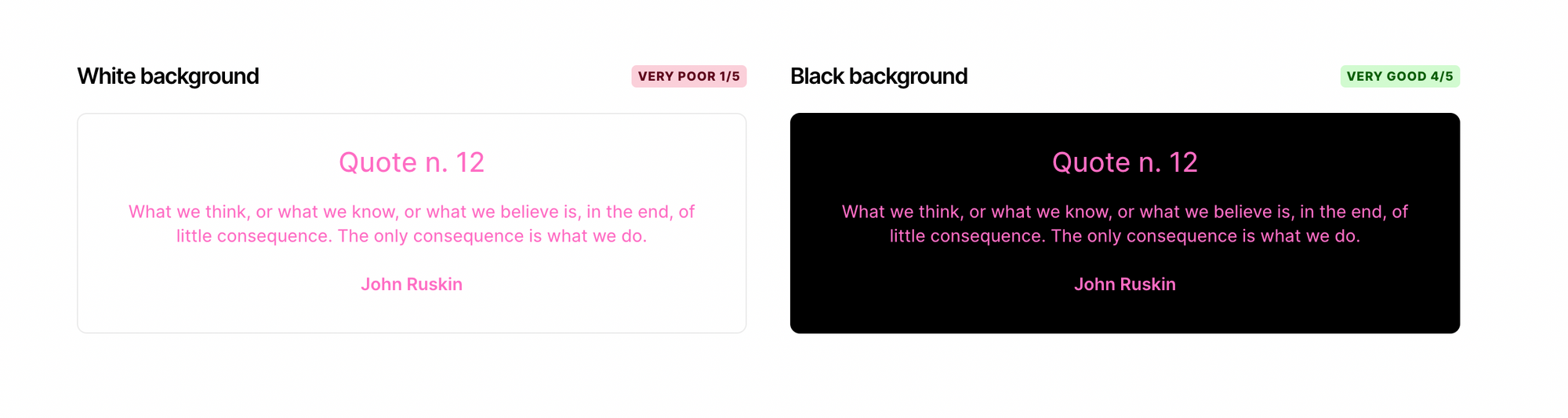
This tool follows the Web Content Accessibility Guidelines (WCAG). It has a straightforward 'click to fix' system to show the optimum tone for legibility, allowing you to work backwards from there. I've used the pink from my blog palette as an example, and as you can see here it isn't suitable for use as a text colour.
What competitors are out there?
There are plenty of colour palette tools floating around, and they aren't all made equal.
The most common alternative is Adobe Color (it used to be called Kuler). It's a solid choice with recently added accessibility tools and a natural link with the Adobe ecosystem. The Adobe Capture app expands on this well, allowing you to grab and edit palettes on your phone for development later on.
Paletton is another I see used often. It has an extremely basic UI, which I suppose is part of the charm. It does the job well for those looking for a quick starting point.
Colormind is another I see popping up. It bears a slight resemblance to Coolors, and as with Paletton, the charm is in the minimalist UI.
I'm yet to find a tool as comprehensive as Coolors, though, or one that suits my design needs so well.
The value of delight
I use Pinterest a lot with clients. It's brilliant for showing a lot at once and helps people visualise what they do and don't think is suitable for their target audience.
What does this have to do with Coolors? Well, on Pinterest, whenever you look at colour palettes, they are generally shown as an image with 5 or 6 of the primary tones blocked out like this:
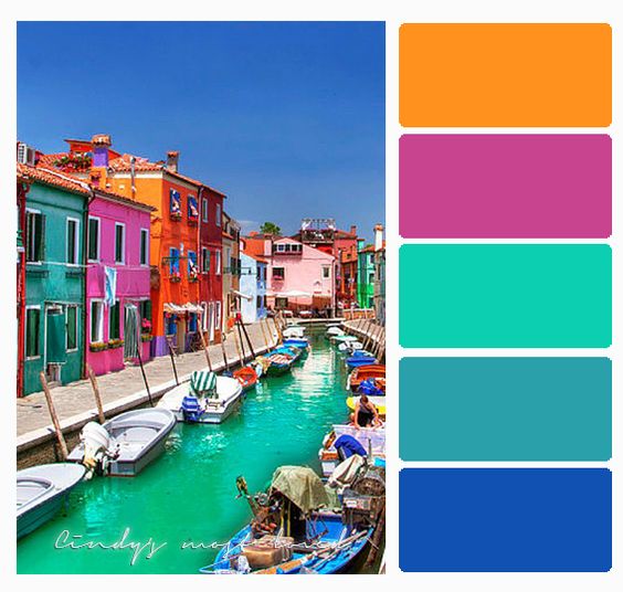
This is particularly useful to show to clients as sending over five spots of colour with no context can be deceptive as to how the palette will be used.
An image gives it so much more depth. Coolors allows you to generate these instantly by uploading an image file and choosing your export options.
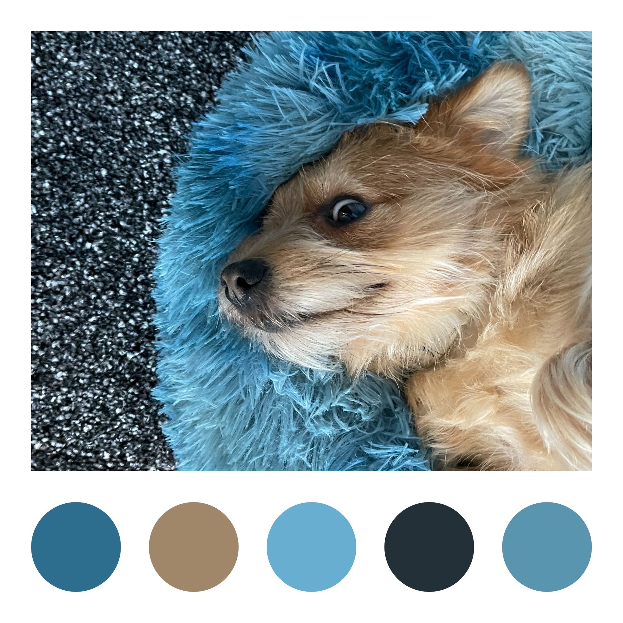
Bean likes to pull faces at me while I'm working. Here's how a photo of him looks exported as a colour palette collage:
Features like this, often called the 'value of delight', elevate the service above the competitors. Having a little easter egg that is useful for your workflow and genuinely fun to use keeps you coming back.
Feeling Coolorful?
So, this was the intense deep dive into Coolors that nobody asked for. Do you currently use it? What features did I miss? How has it helped you with your workflow?
And is there a better tool? Answers on a postcard.
For those of you that haven't heard of Coolors (and I bump into your kind often), give it a go. Sharing ideas and resources is the key to making us all better designers. So if you're sitting on a tool like this, whether it be for colours, typography or whatever, be a dear and clue us in won't you?
If you've found this post interesting, let me know in the comments below. What are your thoughts? Do you agree? Or do you disagree so colourfully you want to slop a big tin of fence paint over my new boots? Please don't do that.
For more Review stuff, click here, and for Starting Point stuff, click here. If you liked this piece, you'd probably be interested in this one about whether standing desks can be beneficial for designers, so go there next.
Remember to be an honest Abe when your Mother-in-law takes you line dancing; I'll catch up with you in the next one.
Want new articles instantly?
Join the newsletter list to read pieces the moment they're published.
Subscribe