Learn to trust your design eye
How do you know what you see is actually real? What tricks are those beady little eyes playing on you? How can you learn to harness this power and use it for evil in your own design work?
“I hope that’s shepherd’s pie in my knickers”.
I was home alone. Just me, all by myself. Minding my own business when I saw the bathroom door handle turn on its own.
It turned aaaaall the way down, then went back to its original position.
After waiting a few seconds and accepting my imminent murder, nothing happened. I had a look behind the door, but nobody was there.
Was it a wee ghostie with an important message? Some weird magnetic force in that area of the bungalow? Burglars? Bandits? Gillian McKeith sniffing around my bins?
Or was I just seeing things and imagining the whole ordeal?
For the sake of convenience (mostly so that I don't have to burn the house to the ground), I'm going to accept that my eyes were playing tricks on me.
Which introduces the tenuous link of the day: How good design is sometimes about tricking your eyes into seeing what you want them to.
And if you're wondering, there have been no spooks since. But that's mostly because I now shower with my eyes firmly squeezed shut while I blindly thrash around to be on the safe side.
Hell hath no fury like a frightened naked pale slippery man.
Mathematical centre vs optical centre
Your eyes are better than maths. You are worth a damn, Irene. Hang in there.
Or, perhaps more accurately, those beady little eyes respond differently to what mathematical outcomes tell them to.
Let's take a sheet of paper. If you were to point at the centre, you'd likely end up slightly above the true halfway point. This is because the natural focal point lies here, called the optical or visual centre. Try it yourself. You’ll get one clap if you’re spot on.
Take this image.

The mathematical centre has been labelled, but it looks quite low, doesn't it? A certain flatness or lack of depth throws the balance off somehow, even though it is pixel perfect.
Now, look at what happens when the same image has the optical centre labelled.

It looks far more interesting. There is harmony there, even though the numbers simply don't add up.
This is something you can apply to your own design, and once you start looking for it, you'll find it everywhere. By adjusting your layouts to balance optically, you learn to trust your eyes and, in turn, create work that feels more natural.
See? The mathy boy on the right is technically correct, but we all know he's a wrong 'un.
Logo footprints
No two logos are built the same.
It is very rare that a logo's width, height, and density measure exactly alike. This means that when you need to show multiple logos alongside each other, you have to revert to trusting your eyes.
Take this spread of six logos as an example (if any of the brands have been cancelled by the time you read this, pretend they're logos for a different company or something).
Let's say that they're companies who are sponsoring an event. A grid is a logical solution, but a funny thing happens if we construct it symmetrically.
They don't look the same size, do they? They measure the same height, but Harry's looks more prominent than HP. This is particularly concerning when a brand is a sponsor as it makes them look less important or perhaps implies that they aren't an equal sponsor. Did they cheap out? Why are they smaller then?
Flipping it so that they measure the same width won't help either. All that will do is make HP massive, and Harry's will look like the wee boy.
This equality can be achieved by ensuring that each logo has the same footprint. They must each have an equal focal impact and coexist as units of the same currency.
Look at this layout. The maths have been sent home because they’re drunk. They embarrassed themselves.
Balance = beauty here, and deviating from the mathematical rule was the only way to do that.
Eyes are creating the design, and eyes are viewing the design. Trust them.
Optical compensation
In the same way that logos have a footprint, so do letters.
Take these two letters. They're the same font, size and weight.

Now let's run a line across the top and bottom.
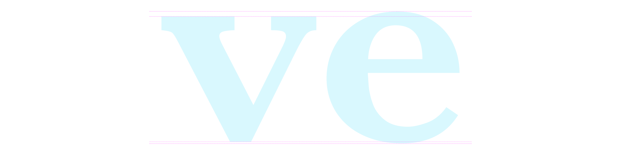
A funny thing happens; they don't line up.
Gasp.
"But everything in design needs to line up."
"Right?"
"RIGHT?!".
Nope. Breaking the rules compensates for inaccuracies in human visual perception.
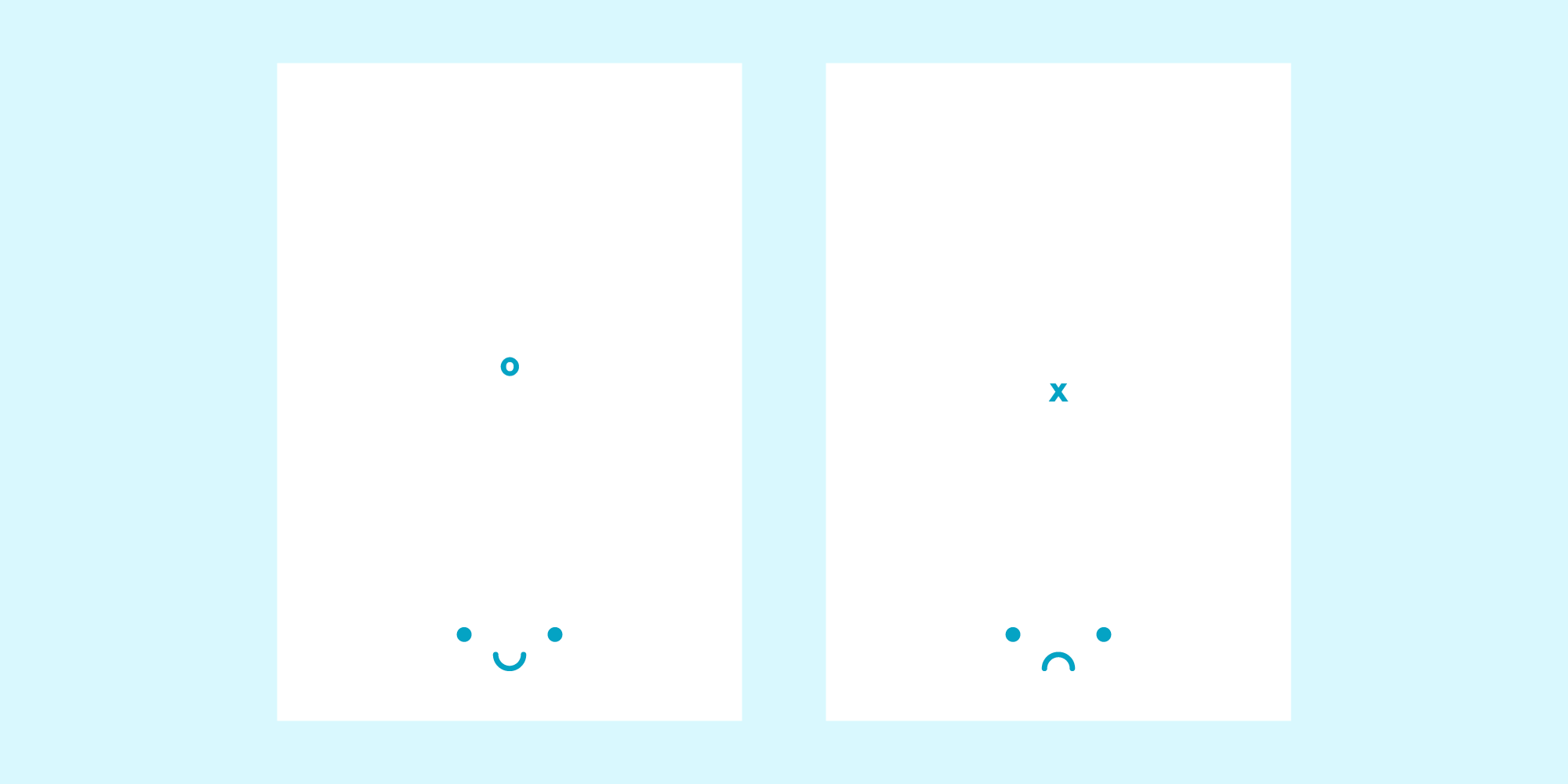
You can apply this beyond text. Even if it's just simple shapes sat in a neat little row. Look at them. Why are they so sad?
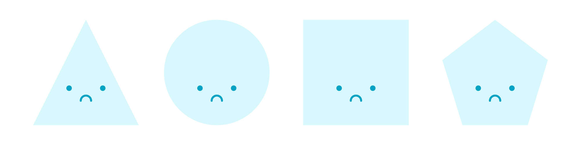
It's because they don't live in a world with equality. The square looks the most important, but he's really not. He's a bad square.
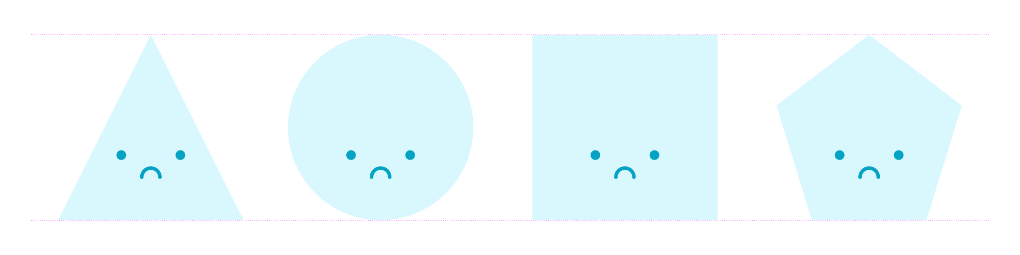
They don't have the same density, so a bit of jiggery-pokery is needed to make it look right to the eye.
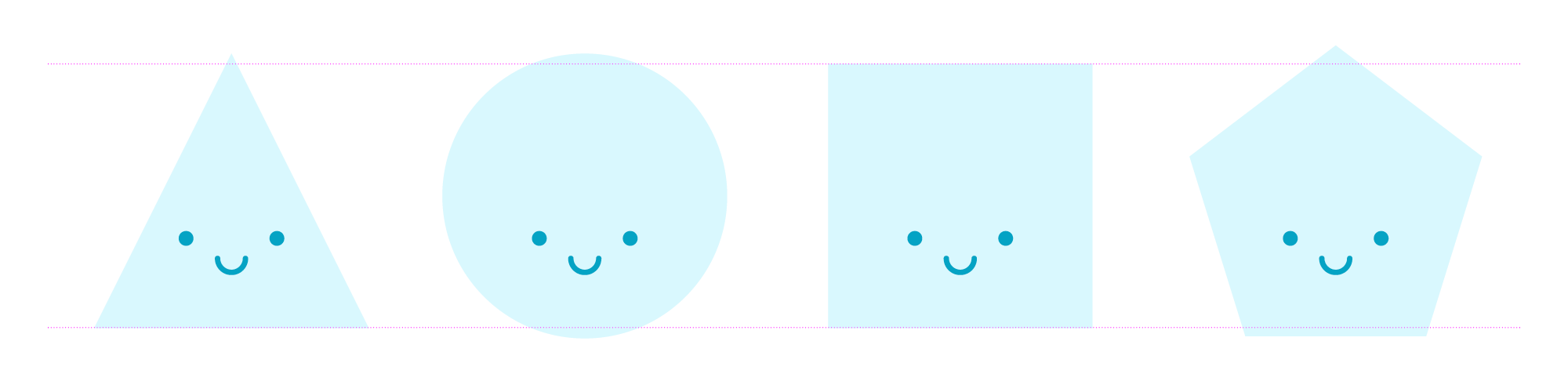
There we go. It's only a very subtle tweak, but it makes all the difference.
Line weights in icons & graphics
I moan quite a lot about iconography. And in general, really. I contributed some thoughts to the Yardstick blog that laid out my personal laws for creating an effective icon set.
In that piece, I spoke about each icon in a set sharing similar characteristics to ensure it belongs. The weight of the line is one of those characteristics, but there are exceptions to this rule.
In an ideal world, you draw up a set of line icons and simply set the weight to the same value.
Take a look at this icon of an eye. Yes, it's an eye, you filthy creature.

There are three elements. The outer circle, the inner circle and the dot for the pupil. No, it's not a nipple. Come on, take this seriously. They look unbalanced but see what happens when we drop some lines over the top.

How do we fix this?
It's simple enough. The relative size difference needs to be accounted for with a slight variance in line weight.
Here is a before and after. Look how well balanced the set looks after a bit of refinement.

Two. Eyes. Ahem.
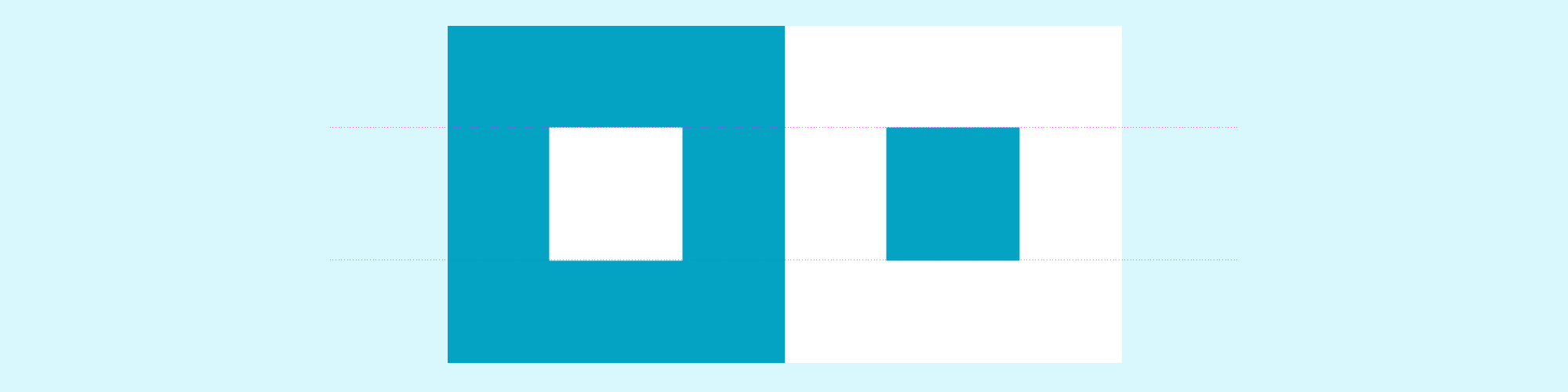
Colour is also used in addition to line weight. In the ancient game of Go, one player uses black stones, the other white. The black stones are slightly larger to counteract the irradiation illusion that makes light areas appear more prominent than dark. The simplest way of showing it is this:

Don’t believe me? Think I’m a liar and a communist? Well, have a peek at this:
How can my eyes earn trust?
For the most part, these skills are developed over time. The key, in the beginning, is realising that something doesn't look quite right and trying to understand it. Knowing how to counteract the various quirks of design will gradually happen as you spend more time designing.
In the short term, the following things helped me:
Don't take anything that is auto-generated as gospel. Automatic kerning settings and predefined midpoints are there as a starter for ten. Don't be afraid to question them if the result looks better after you’ve had your grubby mitts on them.
Reflect. Look back at your work and use them as exercises for improvement. As an intern many years ago, I would spend any spare time revisiting my work to see how it could be improved. Often this was aided by pestering other designers and listening to what they had to say. Don't be afraid to put your work on the table for a constructive group critique. Boiling everything down to build it back stronger accelerated my skillset in the long term. No egos are allowed, though, so only pursue this if you actually want advice.
Our eyes are wonderful things, and the way they battle mathematical rules highlights the importance of the human in design.
It's all we've got to fend off the Roombas and hand dryers from stealing our jobs, so use them, or we’ll all get rounded up and lose them.
If you've found this post educational, let me know in the comments below. What are your thoughts? Do you agree? Or do you disagree so scarily you want to grab me by my feet and swing me about like a figure skater? Please don't do that.
For more Design Basics stuff, click here, and for Starting Point stuff, click here. If you liked this piece, you'd probably be interested in this one about how many projects you should include in your portfolio, so go there next.
Remember to kick and chop wildly in the shower. Nobody is safe. I'll catch up with you in the next one.
Want new articles instantly?
Join the newsletter list to read pieces the moment they're published.
Subscribe